

The Mobile-First Imperative - Why Responsive Design Isn't Enough Anymore
The Mobile-First Imperative: Why Responsive Design Isn't Enough Anymore
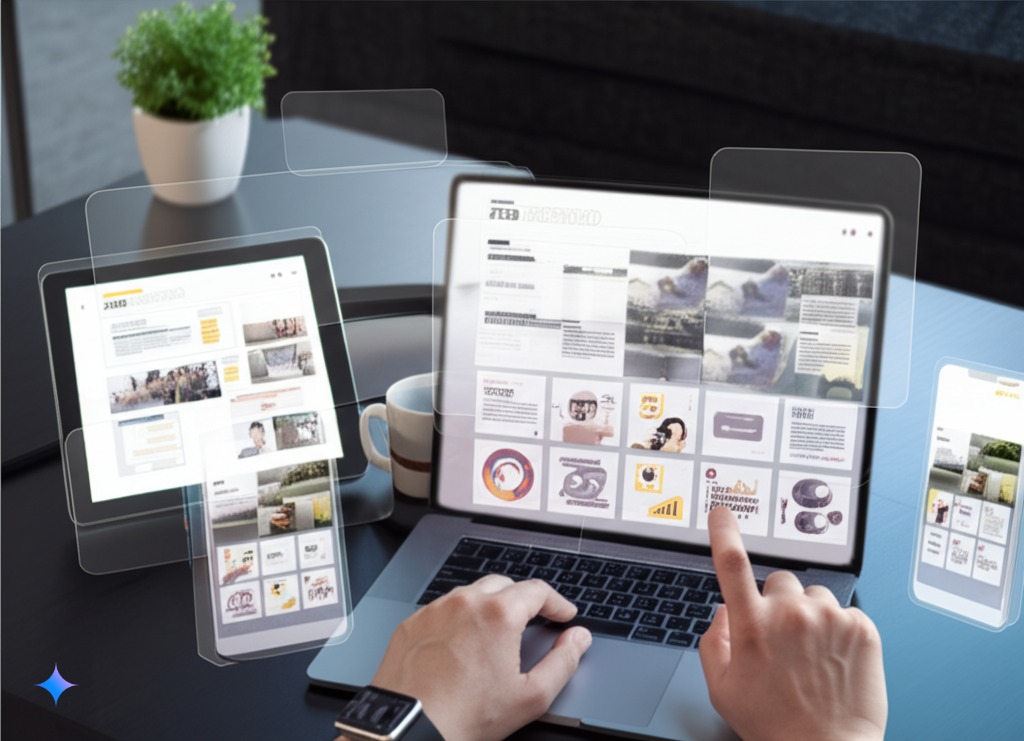
For years, "responsive design" has been the buzzword in web development. Making sure your website adapts to different screen sizes was considered sufficient for providing a good mobile experience. But the digital landscape has shifted dramatically. Today, mobile devices account for the majority of internet traffic. Google uses a mobile-first index, meaning it primarily uses the mobile version of a website for indexing and ranking. Responsive design is now table stakes; a true mobile-first approach is essential.
What is Mobile-First Design (and Why is it Different)?
Responsive design focuses on making a desktop-designed website adapt to smaller screens. It's a reactive approach. Mobile-first design, on the other hand, starts with the mobile experience. It's a proactive approach. The design and development process prioritizes the constraints and opportunities of the mobile environment:
- Smaller Screens: Content and navigation must be carefully considered to avoid clutter and ensure ease of use on a small screen.
- Touch Interaction: Design elements must be optimized for touch input (larger buttons, intuitive gestures).
- Limited Bandwidth: Performance is critical. Mobile users often have slower or less reliable internet connections.
- Context of Use: Mobile users are often on the go, multitasking, and looking for quick information.
Mobile-first design isn't just about shrinking the desktop experience; it's about rethinking the entire user experience for the mobile context.
The Benefits of a Mobile-First Approach
Adopting a mobile-first strategy offers significant advantages:
- Improved User Experience: A website or app designed specifically for mobile provides a smoother, more intuitive, and more engaging experience for the majority of your users.
- Better SEO Performance: Google's mobile-first index directly rewards websites that provide a good mobile experience. Faster loading times, better usability, and optimized content all contribute to higher rankings.
- Higher Conversion Rates: A seamless mobile experience leads to higher engagement, lower bounce rates, and ultimately, more conversions (whether that's sales, leads, or other desired actions).
- Future-Proofing: As mobile usage continues to grow, a mobile-first approach ensures your digital presence is prepared for the future.
- Reduced development cost and time: Focusing on a single core experience (mobile) first can streamline the development process, making it more efficient and potentially less expensive than trying to adapt a complex desktop design later.
Beyond Responsive: Advanced Mobile Strategies
While responsive design is a component of a mobile-first strategy, it's not the whole picture. Here are some more advanced approaches to consider:
- Progressive Web Apps (PWAs): PWAs combine the best of websites and mobile apps. They offer app-like features (push notifications, offline access, home screen icon) while still being accessible through a web browser. PWAs are a powerful way to deliver a highly engaging mobile experience.
- Native Mobile Apps: For certain use cases, a native mobile app (built specifically for iOS or Android) offers the ultimate in performance, access to device features, and user experience.
- Mobile-Specific Content: Consider creating content tailored specifically for mobile users (e.g., shorter, more concise articles, video optimized for vertical viewing).
- Accelerated Mobile Pages (AMP): Though its prominence has diminished somewhat, AMP can still be useful for creating extremely fast-loading versions of your content, particularly for news articles and blog posts. Note: Evaluate carefully if AMP is still right for your specific needs, as its benefits are less clear-cut than they used to be.
How TiltStack Embraces Mobile-First
At TiltStack, we understand the critical importance of a mobile-first approach. We don't just make websites responsive; we design and develop for mobile first. Our process includes:
- Mobile-First Planning: We start by understanding your target audience and their mobile usage patterns.
- User-Centered Design: We prioritize user experience, creating intuitive interfaces and seamless navigation specifically for mobile devices.
- Performance Optimization: We build fast-loading, efficient websites and apps that perform well even on slower connections.
- Expertise in PWAs and Native Apps: We offer both PWA and native app development services to provide the best mobile solution for your needs.
- Thorough Testing: We rigorously test our solutions on a wide range of mobile devices and browsers to ensure a consistent and high-quality experience.
Conclusion
In the mobile-first world, simply having a responsive website isn't enough. Businesses need to embrace a mobile-first mindset to deliver exceptional user experiences, improve their search engine rankings, and stay ahead of the competition. Contact TiltStack today to discuss how we can help you create a winning mobile strategy. We can help in Web and Mobile app development.