

Why Mobile Optimization is Essential for Your Website’s Success | TiltStack
Why Mobile Optimization Is Crucial for Your Website’s Success
In today's digital landscape, mobile optimization is no longer optional—it’s essential. With more users browsing the web on smartphones and tablets, businesses must ensure their websites are mobile-friendly to provide a seamless experience. At TiltStack, we build custom, hand-coded websites that prioritize speed, responsiveness, and usability, ensuring your site performs optimally across all devices.
Why Mobile Optimization Matters
Improved User Experience
A mobile-friendly website enhances user experience by providing fast-loading pages, easy navigation, and an intuitive interface.Higher Search Engine Rankings
Google prioritizes mobile-friendly websites in search rankings. A well-optimized site improves visibility and attracts more organic traffic.Increased Engagement & Conversions
Mobile users are more likely to engage with and convert on a site that is responsive and easy to use, leading to higher sales and lead generation.Faster Loading Speeds
Slow-loading pages drive visitors away. Mobile optimization ensures that your site loads quickly, reducing bounce rates and improving user satisfaction.Competitive Advantage
With many businesses still lagging in mobile optimization, having a fully responsive and fast website gives you an edge over competitors.
Key Elements of Mobile Optimization
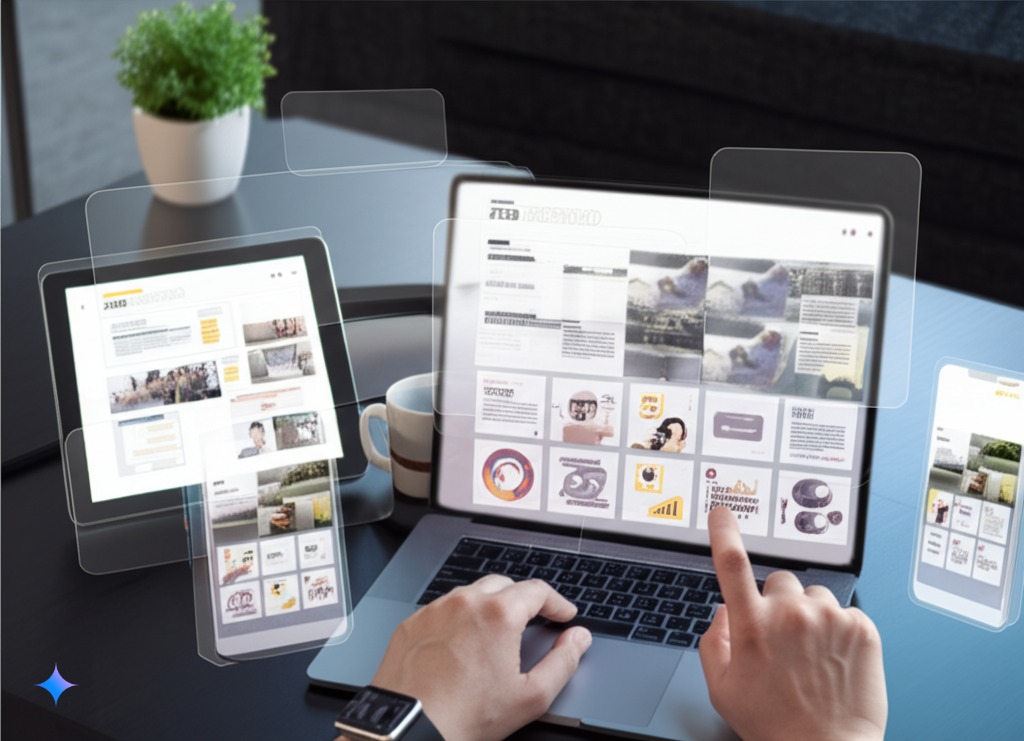
Responsive Design
A website should adapt to any screen size, ensuring a smooth experience on mobile, tablet, and desktop.Optimized Images & Media
Large images and videos slow down websites. We optimize media for fast load times without compromising quality.Mobile-Friendly Navigation
Menus, buttons, and links should be easy to tap and navigate without zooming or excessive scrolling.Minimized Unused Resources
Our hand-coded websites eliminate unnecessary code and scripts, making your site faster and more efficient.Touch-Friendly Elements
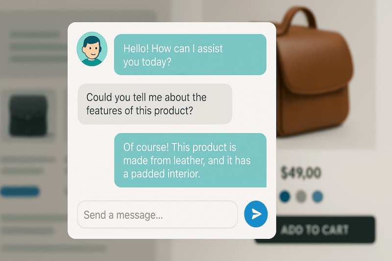
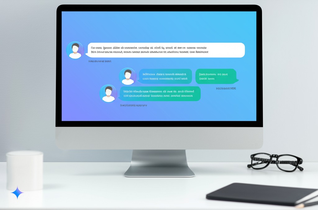
Interactive elements like forms and buttons should be designed for touch interaction, ensuring ease of use for mobile users.Live Features & Contact Options
Implementing live chat, social media feeds, and quick contact options enhances user engagement and accessibility.
Why Choose TiltStack for Mobile Optimization?
At TiltStack, we don’t rely on WordPress or pre-built templates. Our custom web development approach gives us full control over page performance, SEO, and user experience, ensuring a seamless mobile experience.
Get Your Website Mobile-Optimized Today!
Don’t let an unoptimized website hurt your traffic and conversions. Let TiltStack create a fast, responsive, and SEO-friendly site tailored to your business needs.
Contact us at TiltStack.com/contact and ensure your website excels on every device!